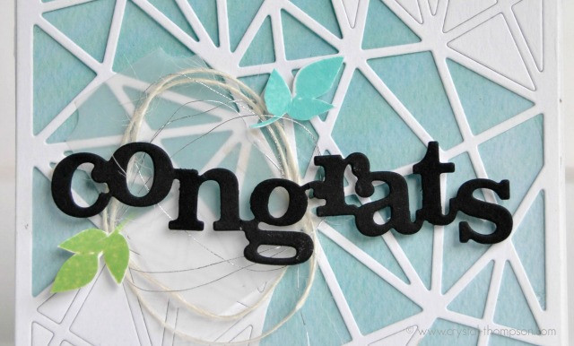
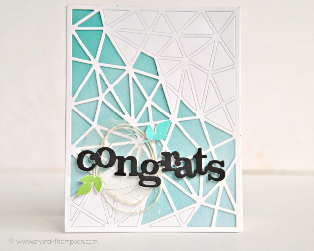
First I started by trimming a piece of patterned paper and adhered to the card base. Next, using Winnie & Walter’s Cover Model: Multifaceted Cutaway I die cut on white card stock using my Big Shot. I did not take out all the triangles, just the center ones. Carefully placing adhesive on the back of each triangle so they don’t fall out when I mail this. Then adhering the die cut to the patterned paper.
To continue with the no stamping, I die cut vellum using “ticket” die from Lana Cutaways, and wrapped silver thread and white twine to it, then glued that to the base.
The “congrats” is from the Spring release In a Word: Congrats Cutaway using black card stock, and then placed on card base with 3D foam adhesive. Voila, the card is ready for some penmanship and be mailed out!
Don’t forget about the ongoing giveaway! Comment on my corresponding Winnie & Walter post on my blog for a chance to win a $30 gift certificate. There will be 4 posts for the month of June, giving you 4 entries to win.
Thanks so much for your time today! Hope you have a great week!






I love the no-stamping card! I often find myself letting the die-cuts tell the story and love how you dressed this one up with the vellum and twine. The fresh colors are so pretty and the sprigs of greenery are perfect!
<3 J
jwoolbright at gmail dot com
HerPeacefulGarden.blogspot.com
This is really a stunner–so creative & beautiful, Crystal!
Awesome card! Love the Multifaceted Cutaway! Pretty colors and details!
Great card–I like the dies you used.
slrdowney at hotmail dot com
Fabulous card! Love your creative use of the cutaway! Beautifully done!
I've been enjoying working with just dies on a few cards and love the fresh modern look. The faceted cover die in white, with blue paper behind it gives a wonderful CAS look that shows off that sentiment perfectly!
Love that you
left out some
of the die cut
pieces so the
pretty background
paper shows! Great
colors.
Carla from Utah
Very pretty!!! I like the you wound the twine into a circle behind the diecut word. Adds a lot of interest to the card along with all the sharp diecutting.
Great card.
I really like the geometric design you did on this
lovely card. And I also love the earthiness that the
twine & thread bring to the design.
this card is gorgeous! love the way you used that cutaway!
Wow! Very interesting design! I love the beautiful blue in the background 🙂
eliseyoung7@yahoo.com
Love the blue color peeking through the open spaces. The black word die looks great against the soft background.
Supercute card, that die is on my wishlist. Great job on the card!
I love this card! What a great idea to only punch out some of the pieces. Looks fabulous and modern!
Love the blue & white! Very pretty! This is a great way to show how to get more out of your dies.
Wow! Beautiful design!!! Love your choiche of colors!!!
Beautiful card 🙂 I lovee the geometrical die cut background and how you left some of the pieces in, looks so cool.
Wow! That background die is awesome!
Wow! That background die is awesome!
Beautiful use of the great die.
Wow..beautiful card..and love the background so much..Thanks for sharing.
The geometric die is very cool and I like how you put some of the pieces back in.
Comments are closed.